Spatch / 2014–15
Email for professionals.
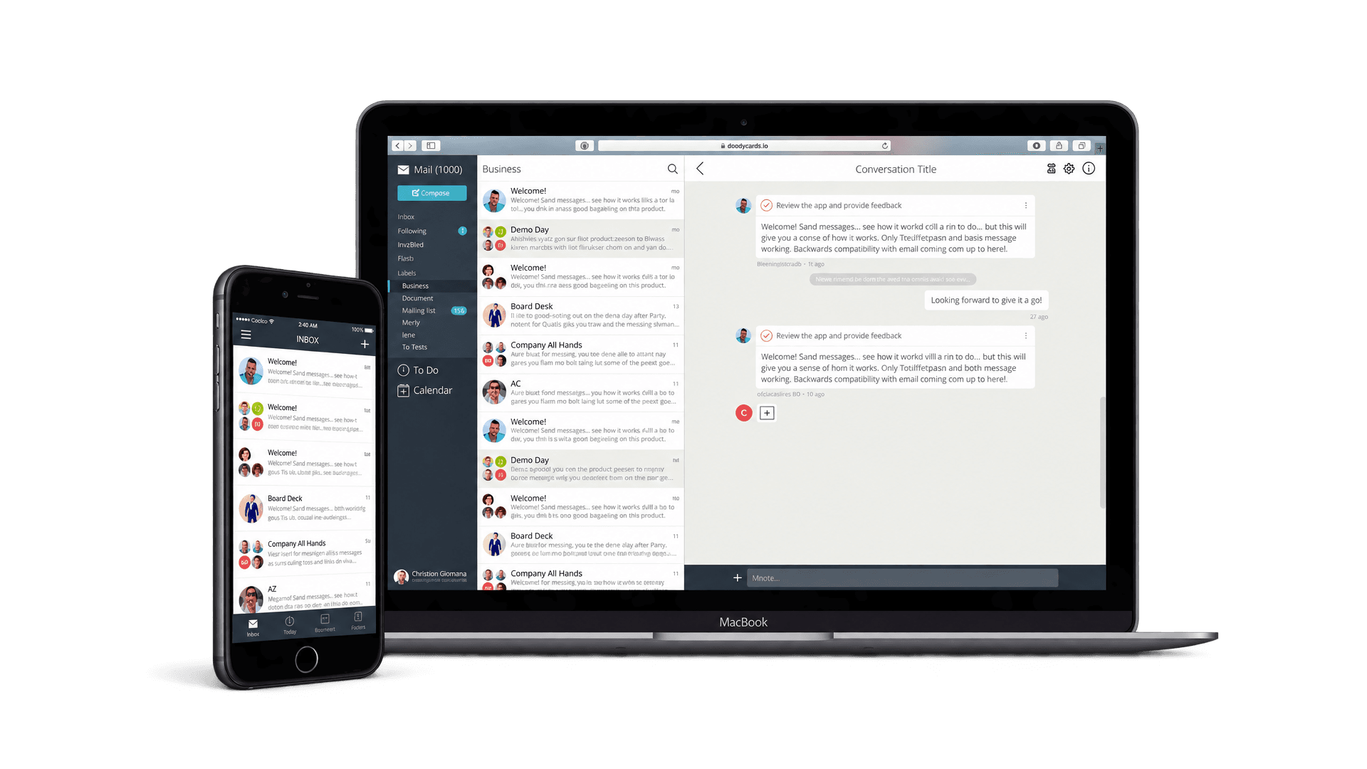
- Problem
- A startup from San Francisco, in London for Techstars, with the mission of dramatically reducing the time professionals spend dealing with email. When I joined there was a partially developed iPhone prototype and no calendar. That was the largest missing piece, and the one the fundraising needed most.
- My part
- First employee, product designer, reporting directly to the CEO. I wrote the design strategy, designed the calendar from scratch and tested it with a prototype, then refined the mobile app and moved on to the desktop web app. I also hired the first engineers and set up the process.
- The idea
- Scheduling should happen inside the calendar. Picking a time, or picking between proposed times, makes no sense without your actual schedule in front of you.
- What shipped
- The mobile calendar. After demo day TechCrunch counted Spatch among the most promising startups to come out of Techstars, and investors called the mobile app a killer app. It raised $3.2M, a record seed round for Europe at the time.
Spatch was a technology startup from San Francisco with the mission of dramatically reducing the time professionals spend dealing with email. They moved to London for the Techstars accelerator, and in mid-2014, through a recommendation, I joined as first employee and product designer, reporting directly to the CEO. At that time there was only a partially developed prototype for iPhone. The product went on to support several platforms.
Design strategy
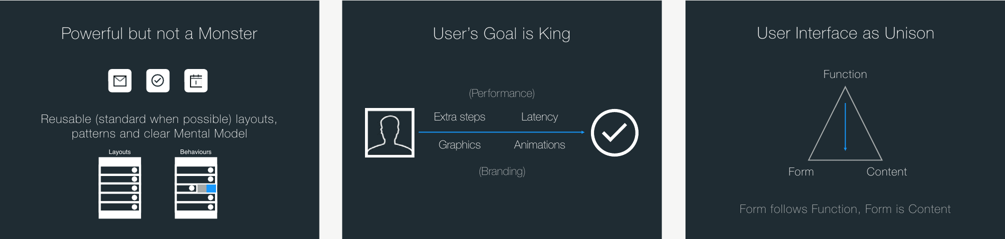
I outlined a design strategy for the entire product and a small set of principles to help the design process. Powerful but not a monster: reusable layouts and behaviours, standard where possible, and a clear mental model. The user’s goal is king: extra steps, latency, graphics and animations are all judged by whether they get in the way of it. And the user interface as unison: form follows function, form is content.
The strategy went into a 25-page deck together with the latest iteration of the design. This became a useful tool during fundraising, for reassuring potential investors that the startup could execute its vision.
The calendar
I was asked to illustrate the product vision in the best way possible to support fundraising. The calendar was the largest missing component of the product, and its design was critical because it covered important use cases. The first task was to design this whole new section of the app, paying particular attention to scheduling meetings, from both the sender’s and the recipient’s perspective.
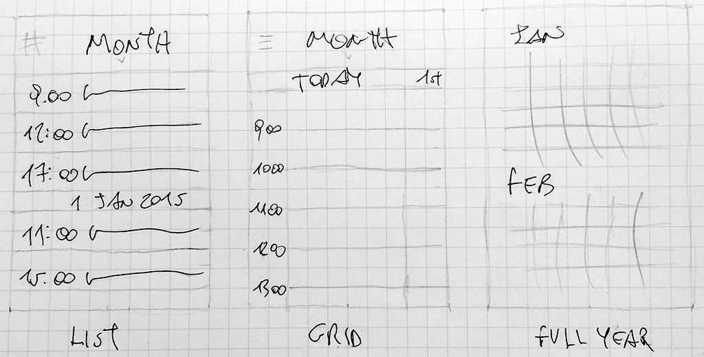
I started by evaluating the calendar app market, which by then was already mature. The majority of apps mix a list and a grid in the same view. I opted for distinct and familiar layouts instead. The plan was to gradually make the list view redundant, covering its main use cases with the grid, and eventually end up with only two layouts: grid and full year.
Scheduling in context
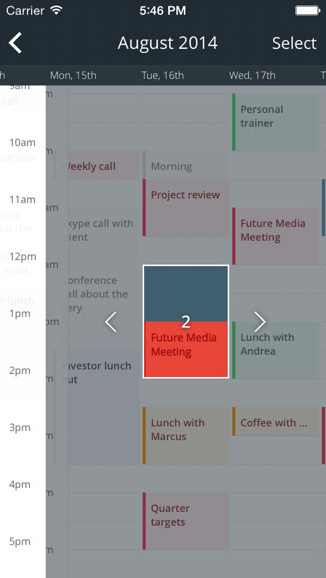
My analysis of competitors showed that none of the popular apps gave enough context while scheduling, because choosing the time of an event was totally disconnected from the calendar view. I explored selecting the time inside the calendar with an Adobe Flash prototype, and then used it for guerrilla user testing.
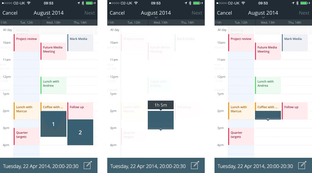
When you receive a meeting request you have to send back a confirmation, and if more than one option was proposed you have to pick the one that suits you. I chose to show the options in the context of your actual schedule, with overlaps against existing commitments highlighted. It supports the decision and removes a screen people would otherwise have to learn.
Outcome
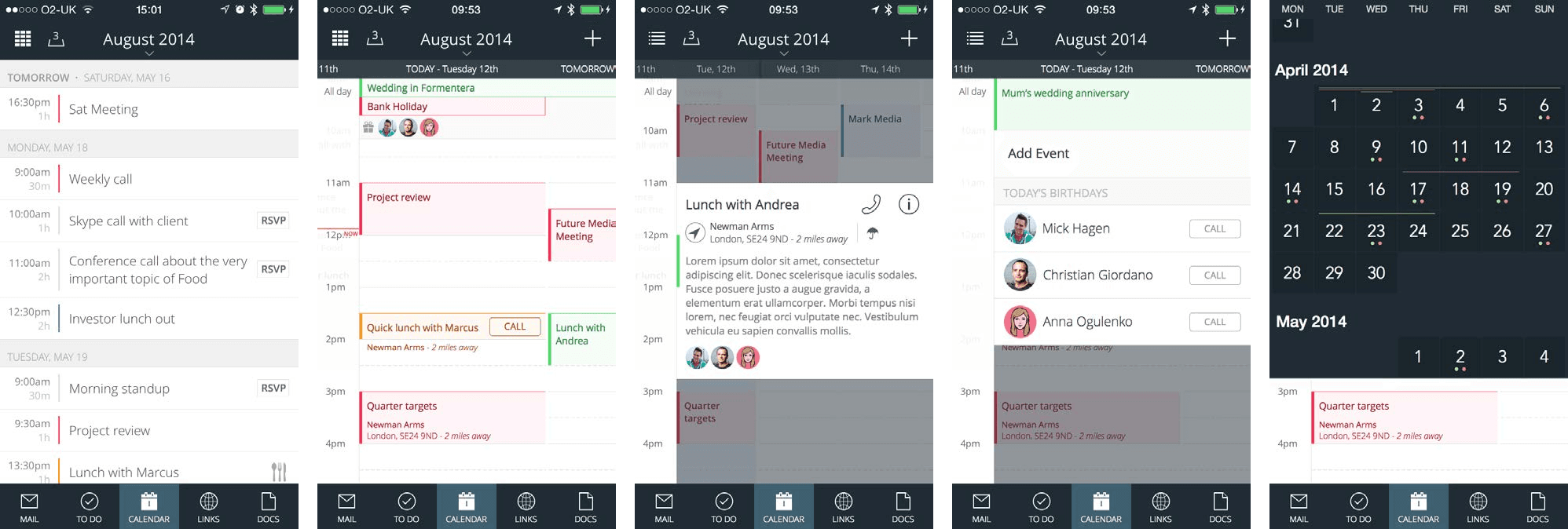
After demo day, TechCrunch and others considered Spatch one of the most promising startups to come out of Techstars. Investors called the mobile app a killer app, and when the programme ended Spatch raised $3.2M from European and American VCs, a record seed round for Europe at the time.
After the seed round
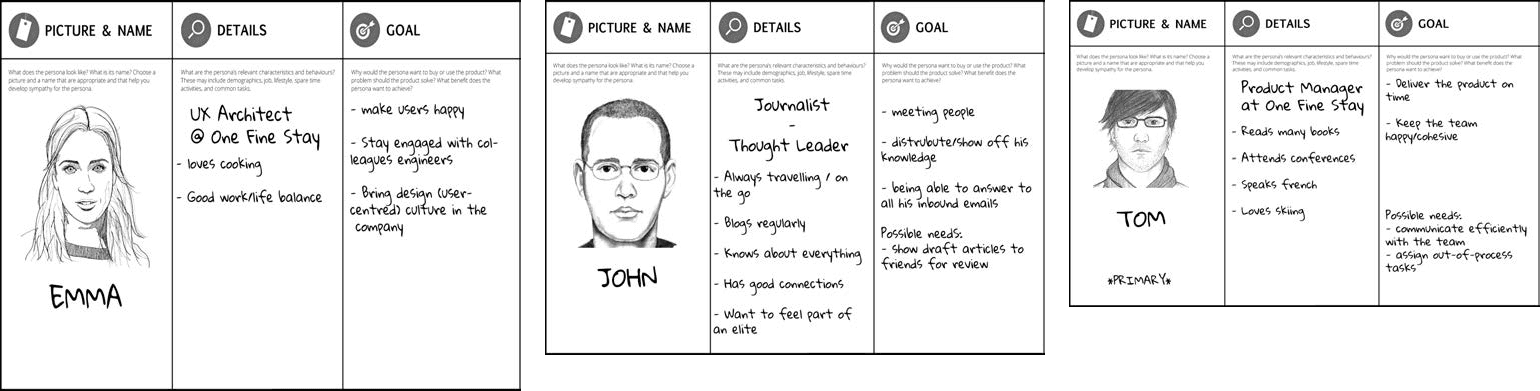
With the round closed I had the chance to refine the mobile experience with more accurate research of the target audience. I defined a few proto-personas and explored solutions for their specific pain points. Since we were building a comprehensive office suite, adding a feature always started with a look at the most successful specialised apps.
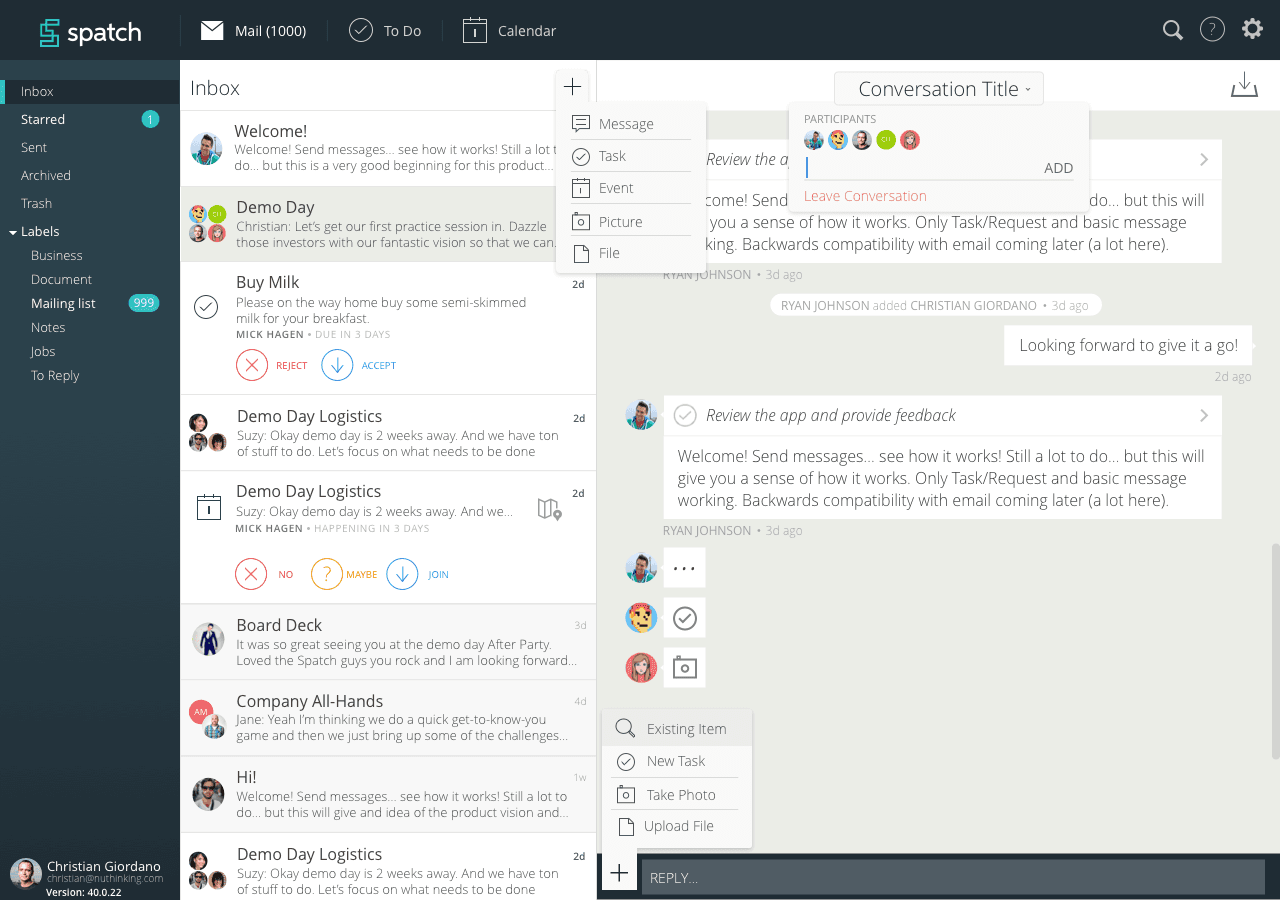
I also did the hiring: a talented JavaScript engineer from SoundCloud, and an experienced full-stack developer I had known for years, who had been my employer in Italy ten years earlier. We set up a Kanban flow in Sprintly to measure velocity and plan iterations better. Towards the end of my involvement I moved into the design of the web desktop experience.
Looking back
This was my first time inside a VC-backed startup from the very early stages, and it taught me a lot. The design lesson I kept is about context: the calendar worked because picking a time, or answering a request, happened on top of the schedule itself, and I have come back to that idea many times since. The other lesson is that a clear design strategy is a fundraising asset. A 25-page deck with principles and the latest design did more to reassure investors than any pitch about features. I also learned to argue harder against chasing one big customer too early, and against building your own protocol.
I left about a year after the round. Spatch later moved away from the product towards infrastructure and crypto, under new names.