Barclays / 2015–16
Upgrade of the bank’s design language for a mobile-first world.
- Problem
- Digital design had changed profoundly in a couple of years. Most of the focus had moved to mobile, and interfaces had become flat, simpler but more engaging. That made the visual language of many brands quickly obsolete, Barclays’ included.
- My part
- Hired as interaction designer by the Design Language team to make their reusable patterns more immersive and mobile-first. When it became evident the whole visual language needed a refresh first, the team moved me onto that, reporting to the Creative Director. Interaction and motion design.
- The idea
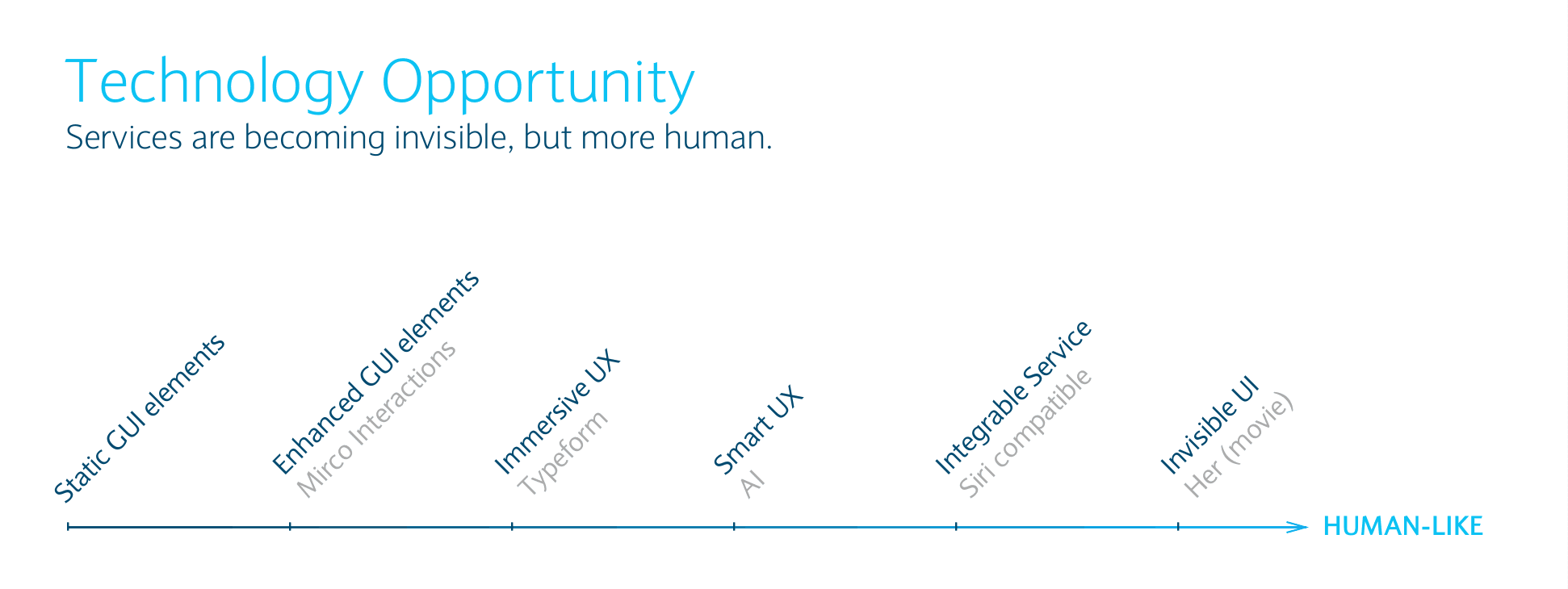
- Services are becoming invisible, but more human. Richer patterns were only the first step of a longer journey for the brand, and the progressive humanisation of its interfaces was the part to design for.
- What shipped
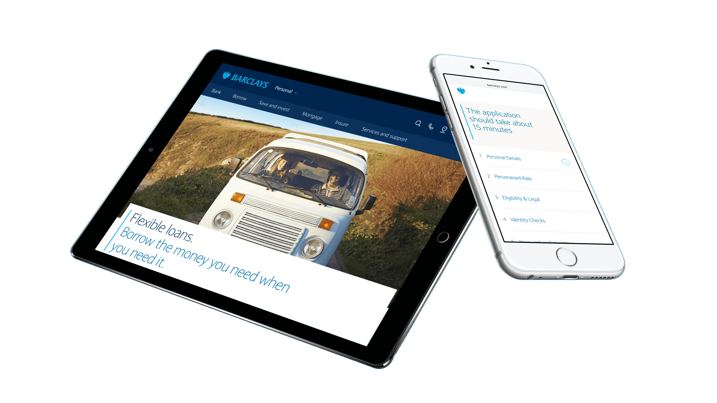
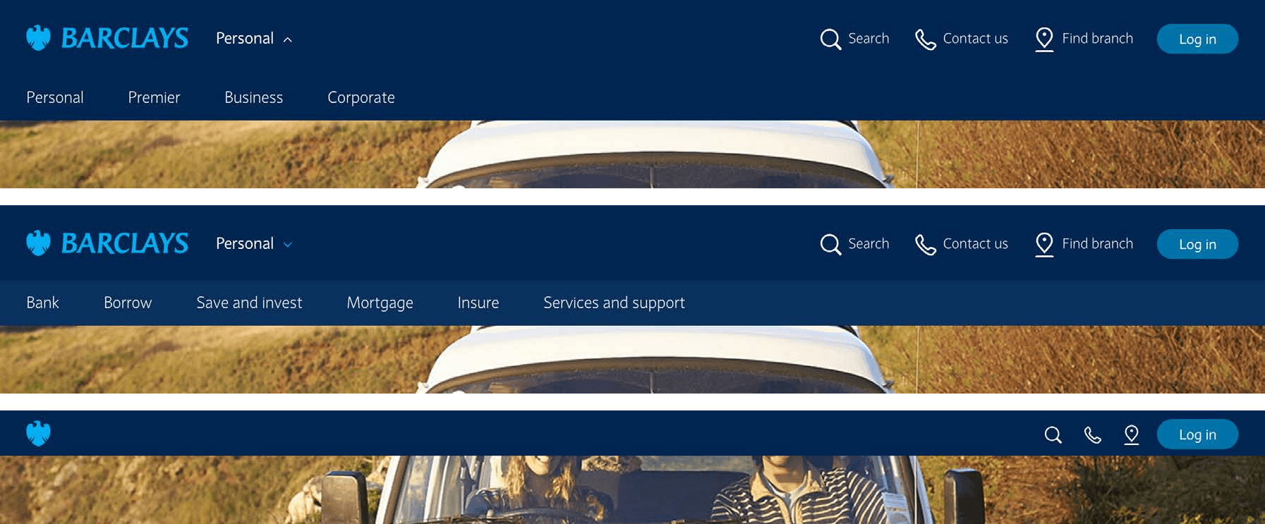
- The first component embedding the new design language: a modular header that sticks to the top after scrolling, keeping the branding and the core actions always accessible.
In mid-2015 the Design Language team at Barclays hired me as an interaction designer to help iterate their reusable interaction patterns, with the intention of making them more immersive and mobile-first. It soon became evident that the overall visual language needed a solid refresh before any strong new design work could be conceived, so the team moved me onto that, a new and ambitious endeavour, reporting to the Creative Director.
The purpose was to refresh the brand’s expression on digital products, prioritising simplicity and immersiveness.
The roadmap
The initial need was to improve the set of reusable patterns into a richer one. It was apparent to me that this was only one of the first steps of a journey, enabled by technology, that the brand would have to undertake. I mapped that journey out. A key part of it was the progressive humanisation of the user interfaces, which gave us the opportunity to explore the brand’s personality in more depth.
Transactions
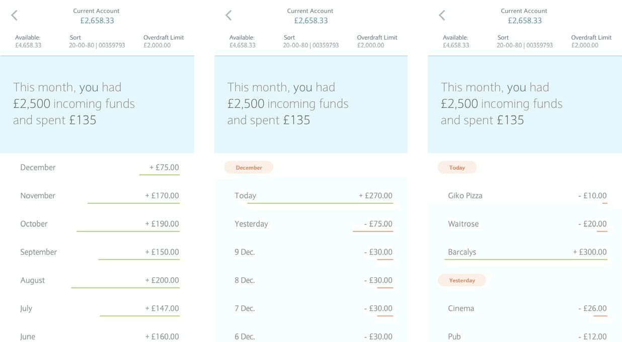
Once the scope had expanded to the whole visual language, we focused on signature experiences. For Barclays, as for any bank, those were the account transactions and the input forms. To let people navigate their transactions better I came up with a zoomable table view, where transactions could be aggregated by days and months.
Forms
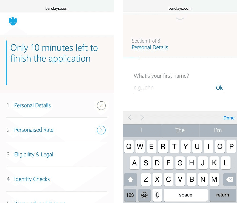
Forms are also key scenarios for a financial institution. Because they are often lengthy, the objective was to shape the perception of time and effort. Web technology now allowed them to be much more immersive. With Typeform as the benchmark, we extended its paradigm to much longer journeys, which could also be resumed. Forms also gave us the opportunity to be more conversational in the way we spoke to customers.
The header
The first component to embed the new design language was the modular header. After scrolling it sticks to the top, retaining the branding and keeping the core actions always accessible.
Looking back
It was fascinating to work on the system around an iconic brand, with all the constraints that brings. Even the colours were a challenge: some of them behave very differently on screen and off it, and the design language had to hold up in both. It was also a welcome return to the body language of a brand, its motion, which I had last worked on for Ubuntu.