Instants / 2013
Photo browsing at the speed of light.
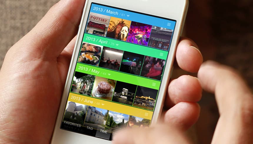
- Problem
- Phones made it easy to take photos and camera rolls grew beyond measure. Up until iOS 7 the Photos app didn’t scale with them. Finding an old photo meant scrolling forever.
- My part
- A personal project after I left Canonical. Product design, native iOS development and marketing. I wanted to take what I’d learned on Ubuntu to another platform and verify some ideas I had about touch user interfaces.
- The idea
- A few specialised ways to browse, depending on what you remember about the photo. And gestures instead of confirmation dialogs.
- What shipped
- Released on the App Store a month after iOS 7, which had just added Moments and favourites. Featured on CNET and Cult of Mac. Second in Photo & Video in Italy for a week, sixth in India, fourteenth in the UK.
Instants was a personal project I started in 2012, after I left Canonical. I wanted to take what I had learned designing core interactions for Ubuntu to another platform, iOS, and verify some ideas I had about touch-driven interactions. I also wanted to get familiar with native development. It was inspiring to see how such a mature framework solved common problems.
Taking a photo is the best way to capture a memory, and phones made it so easy that camera rolls grew beyond measure. Up until iOS 7 the Photos app didn’t scale with that. Finding an old photo meant endless scrolling. So I set out to release a photo browser optimised for search speed.
Lenses
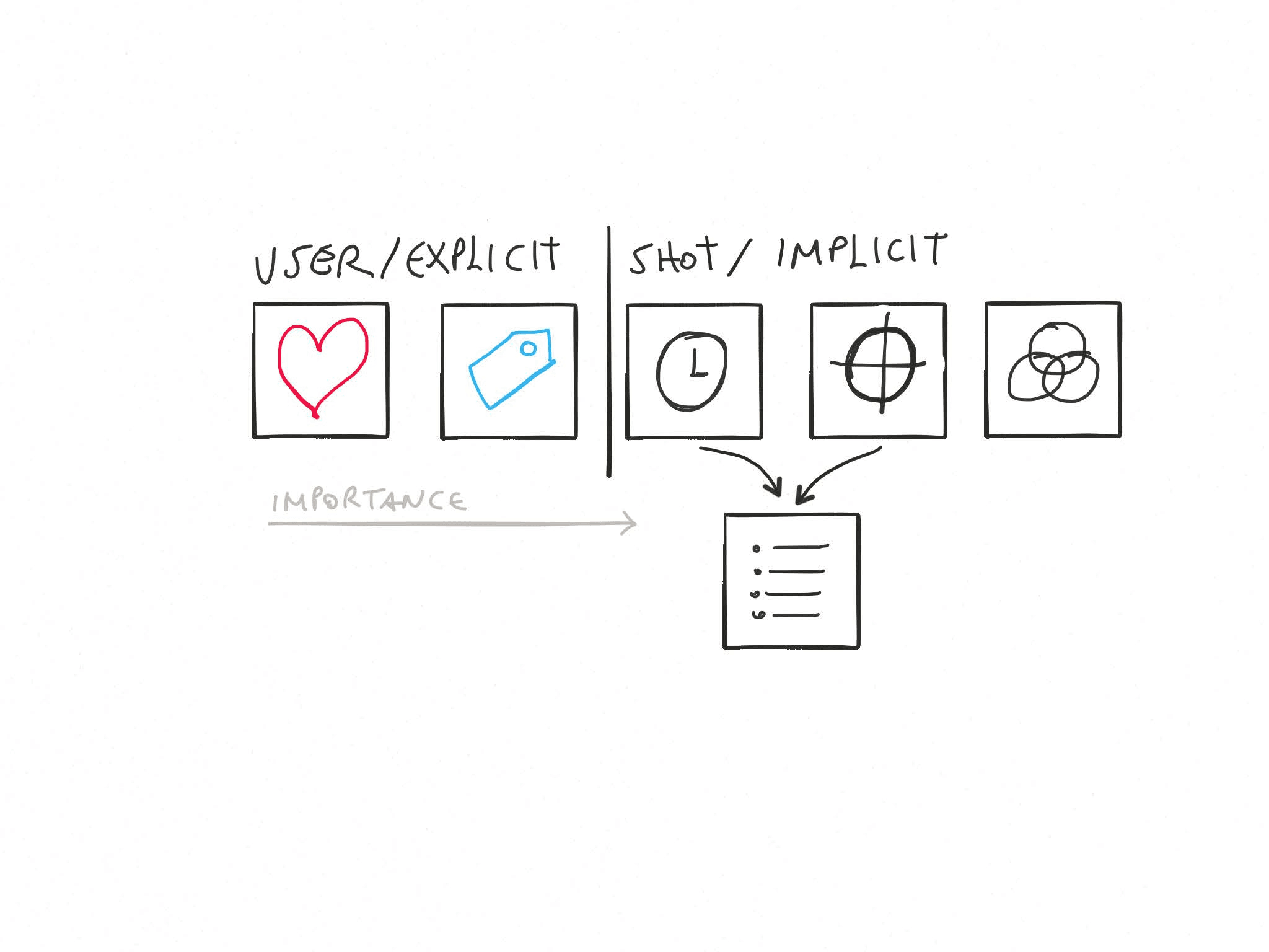
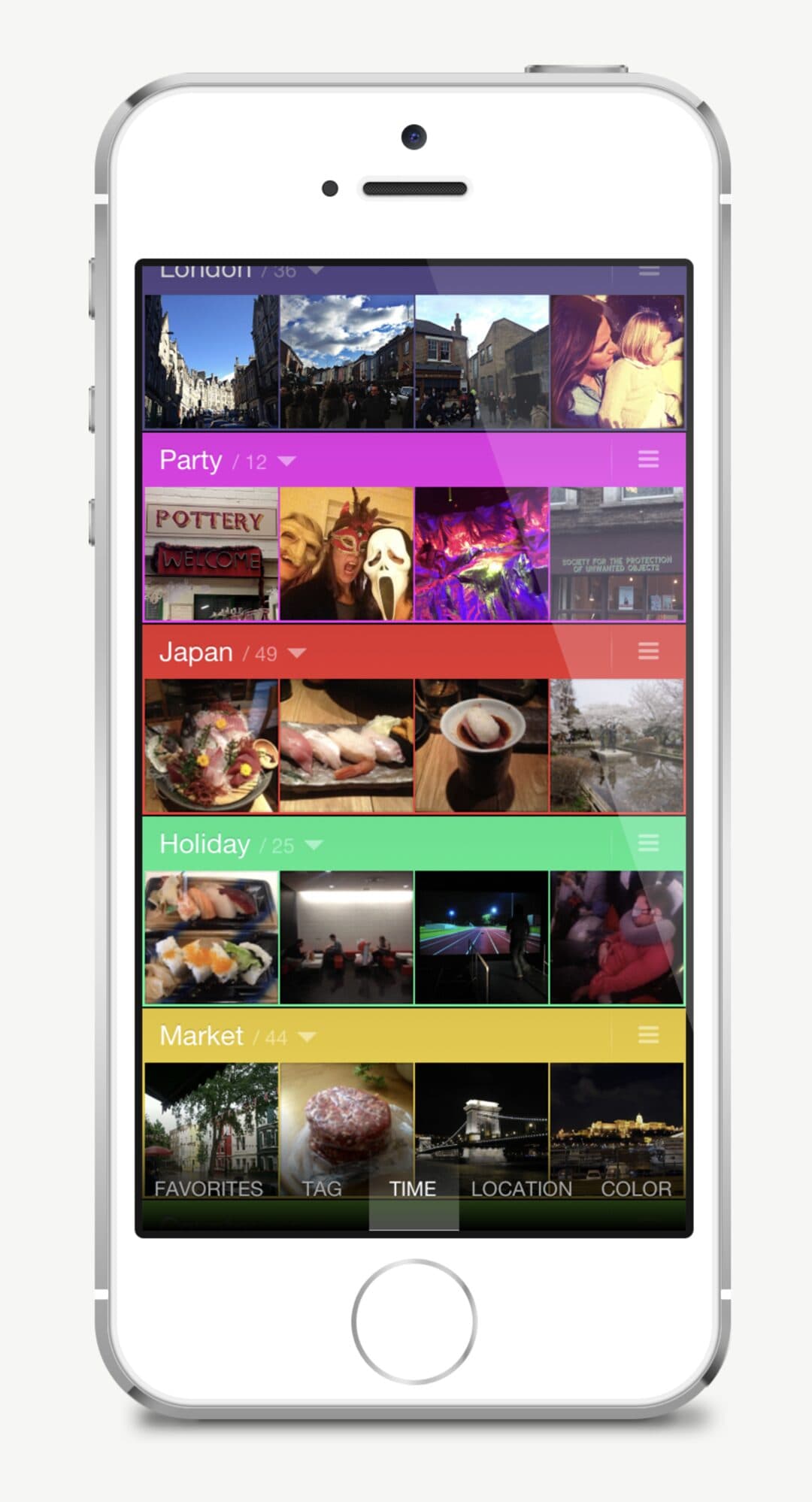
A relatively inexpensive way to speed up a visual search is to give people a few specialised ways to browse, depending on what they might remember. The main navigation was built on these lenses. The most important lenses relied on metadata people had added themselves, favourites and tags. The others used implicit properties of the photos: when they were taken, where, and their dominant colours.
Groups
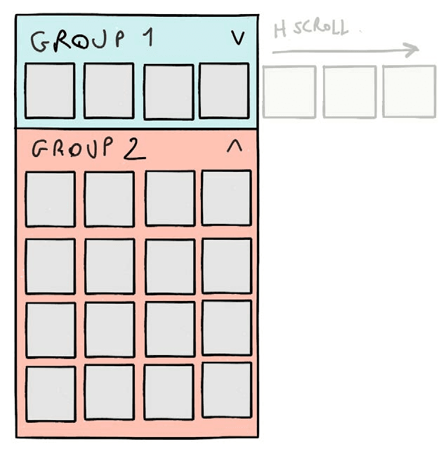
Where it could, the app split the long list into groups on its own, by month or by city depending on the lens. It kept browsing manageable without folders, which are notoriously hard to manage. Groups could be colour-coded with a simple gesture, and in the date lens you could split a group if you had shot a lot in one month.
Meaningful gestures
To avoid the complexity of an undo manager I had to ask for confirmation before some destructive actions. A dialog with text to read is too distracting in an immersive, touch-driven experience, and it stops working the moment people start ignoring it. So I looked for ways to express the confirmation with a gesture that meant something in relation to the action: slide across a group to split it, drag a photo down to the bin to delete it. This is still one of the things I’m proudest of in the app.

Made to stick
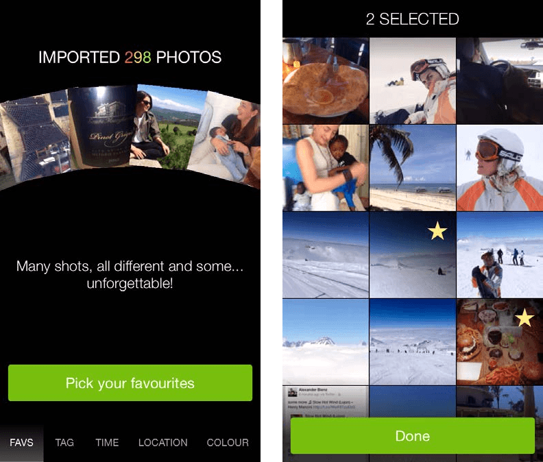
Most apps get used once, then forgotten, then deleted at the next spring clean. One way to create some attachment is to have people invest a bit of time in the app, creating content they will find useful later. So on first launch Instants asked you to quickly pick your favourite pictures, in a seamless flow.
Outcome
A month before Instants was released, Apple introduced iOS 7 with a much improved Photos app. It had auto-grouping into Moments and a favourites list, which was most of what Instants did. That killed the market opportunity on the spot.
Despite that, or perhaps thanks to it, Instants was featured on CNET and Cult of Mac and got thousands of downloads. It held the second spot in Photo & Video in Italy for a week, reached sixth in India and fourteenth in the UK. Before the release I had made a microsite and a press kit, and approached many blogs with review codes.
Something else came out of it: Swipe-Through, the prototyping platform I built to design it. More on that below.
Looking back
This was always going to be a hard business, and I knew it going in. Apple caught up quickly and improved the native Photos app dramatically. But it was an educational experience for designing for touch, and for rich interactions in general. The lesson I kept is that a touch interface should be forgiving and meaningful: forgiving because fingers are imprecise and there is no undo you can count on, meaningful because a gesture should relate to what it does.
If I did it again I would involve more people from outside in the design process. I had some happy users, but more of them, earlier, would have helped the design and probably the distribution too.
That I ended up building a dedicated prototyping platform for it says how much there was to learn. Swipe-Through is built on top of Adobe Flash. You craft the animations on a linear timeline, then drive that timeline with touch, so an interaction can be felt on the device before any of it is coded. I went on to use it for other commercial projects.