Ubuntu / 2010–12
Interaction design for the world’s most popular Linux desktop.
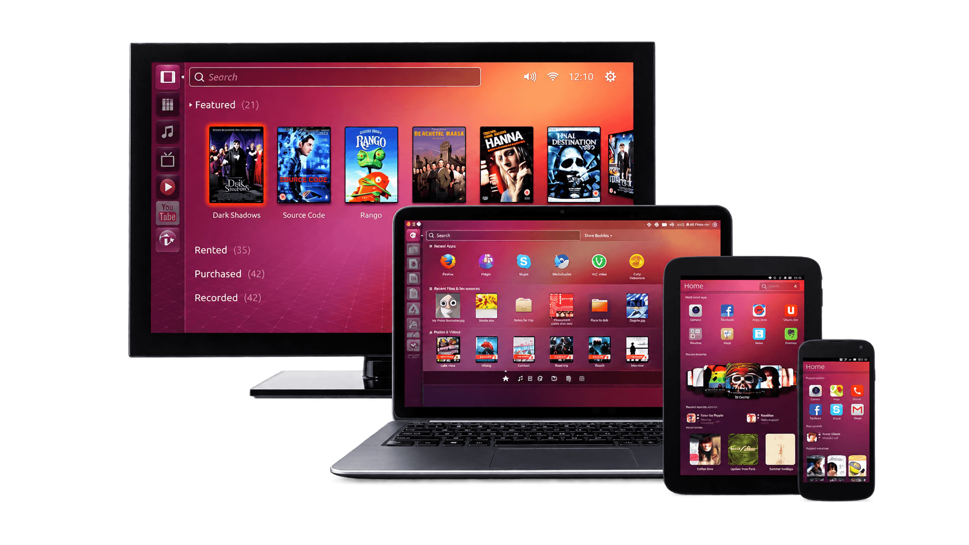
- Problem
- A year after I joined Canonical, Ubuntu started its transformation into a multiple form-factor operating system. Existing solutions had to be revisited for different input and output methods and for new use cases. I took on the notifications framework.
- My part
- One of the first UX designers on Ubuntu, when it was desktop only. Designers owned their features: collecting requirements, designing and testing options, pitching the strongest one to the developers and following the implementation through QA.
- The idea
- Notifications shouldn’t all behave the same. What matters is the kind of event, how expected, urgent or actionable it is, and the device it lands on.
- What shipped
- The app Launcher, the Overlay Scrollbars and the redesign of System Settings on the desktop, plus animation guidelines for shell engineers and app developers.
When I joined Canonical in 2010, Ubuntu had over twelve million users. It was open source, with many contributors, but controlled by Canonical, a company of more than five hundred people. I was one of the first UX designers, hired when Ubuntu was only available for desktop. The design team later grew to more than twenty people to cover phones, tablets and more.
At Canonical the UX designers effectively owned the features. Requirements came from bug tracking, competitor analysis or simply internal ideas. Because a new version shipped every six months, and because implementing a feature took a considerable amount of engineering, solutions were iterated heavily before release, with the support of visual designers and eventually prototypes for user testing. Different solutions were designed and tested, the strongest was pitched to the developers so they would embrace it, and the implementation was followed through QA. The features I shipped this way were the app Launcher, the Overlay Scrollbars and the redesign of System Settings. Other concepts got some media attention but never made it out.
The Launcher
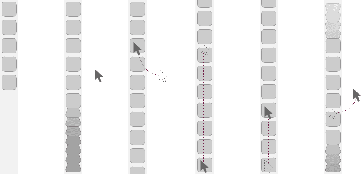
The Launcher is the strip of application tiles on the left of the Ubuntu desktop, the equivalent of the Dock on the Mac. It had to be designed for scale: people install a lot of software, and the strip had to handle many more tiles than fit on the screen without becoming a scrolling list. The Dock grows the icons under the pointer, which is pleasant but slow when you want a specific tile in a long list. Instead, the tiles that don’t fit fold up at the bottom of the strip, and unfold as the pointer reaches them. Dragging along the strip follows the same physics as the rest of the shell, with resistance, momentum and snapping.
The hard part was keeping it simple, above all in how it felt. The result was powerful and still easy to use. I owned the whole thing, from the behaviour spec and the prototypes to the visuals, and it shipped with Unity in Ubuntu 11.04.
Overlay Scrollbars
The Overlay Scrollbars were a project Canonical’s founder cared about personally. The idea was to get the scrollbar out of the way: a thin indicator instead of a permanent bar, with the handle appearing only when the pointer comes close. My job was as much stakeholder management as design, finding the version that delivered on his ambition without giving up usability. A lot of that came down to smart behaviour: where the handle showed up depended on how close the window was to the edge of the screen or to other windows, so it never ended up somewhere you couldn’t reach. As with the Launcher, a functional prototype and a detailed behaviour spec carried it through engineering.
Notifications
A year after I joined, Ubuntu started its transformation into a multiple form-factor operating system. Some of the existing solutions had to be revisited to adapt to different input and output methods and to cover more current use cases. I took on the review of the notifications framework.
Collecting current issues
Because of the open source nature of the product, the community is well educated in communicating technical and design issues on a public issue tracker. It was relatively easy to gather this data and merge it with what the design team had experienced on a daily basis while dogfooding.
Categorising events
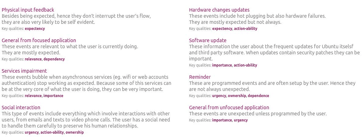
To evaluate how solid the current system was, I categorised the different types of possible events and assigned them some common qualities: expectancy, relevance, importance, urgency, whether they can be acted on, whether the user owns them.
Form factor qualities
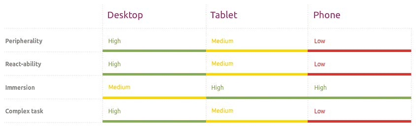
To help guide the exploration, I outlined the main differences between the form factors: how peripheral the device is, how easily you can react on it, how immersive it is, and how complex the tasks are.
Exploration
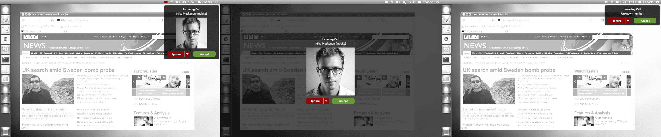
I explored two different routes. One was more conservative, based on consistent and predictable behaviours. The other was more contextual, where the intrusion of a notification depended on auxiliary data, like the social graph of the people involved. Below, the different behaviours of an incoming call in the contextual route.
Interactive notifications
I also explored ways to provide multiple actions in a single notification, to give more functionality to the applications developed for Ubuntu. This effectively let people handle events similar to those handled by standard dialogs. The use cases were documented in Balsamiq, then animated at low fidelity in Flash and at high fidelity in After Effects.
System Settings
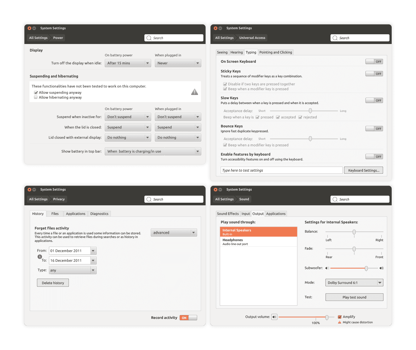
System Settings is a more entangled piece than the shell components. It is also the kind of place that gets polluted by fast-moving software: every release adds a panel or an option somewhere, and every now and then a clean-up is due. This was one of those.
Animation guidelines
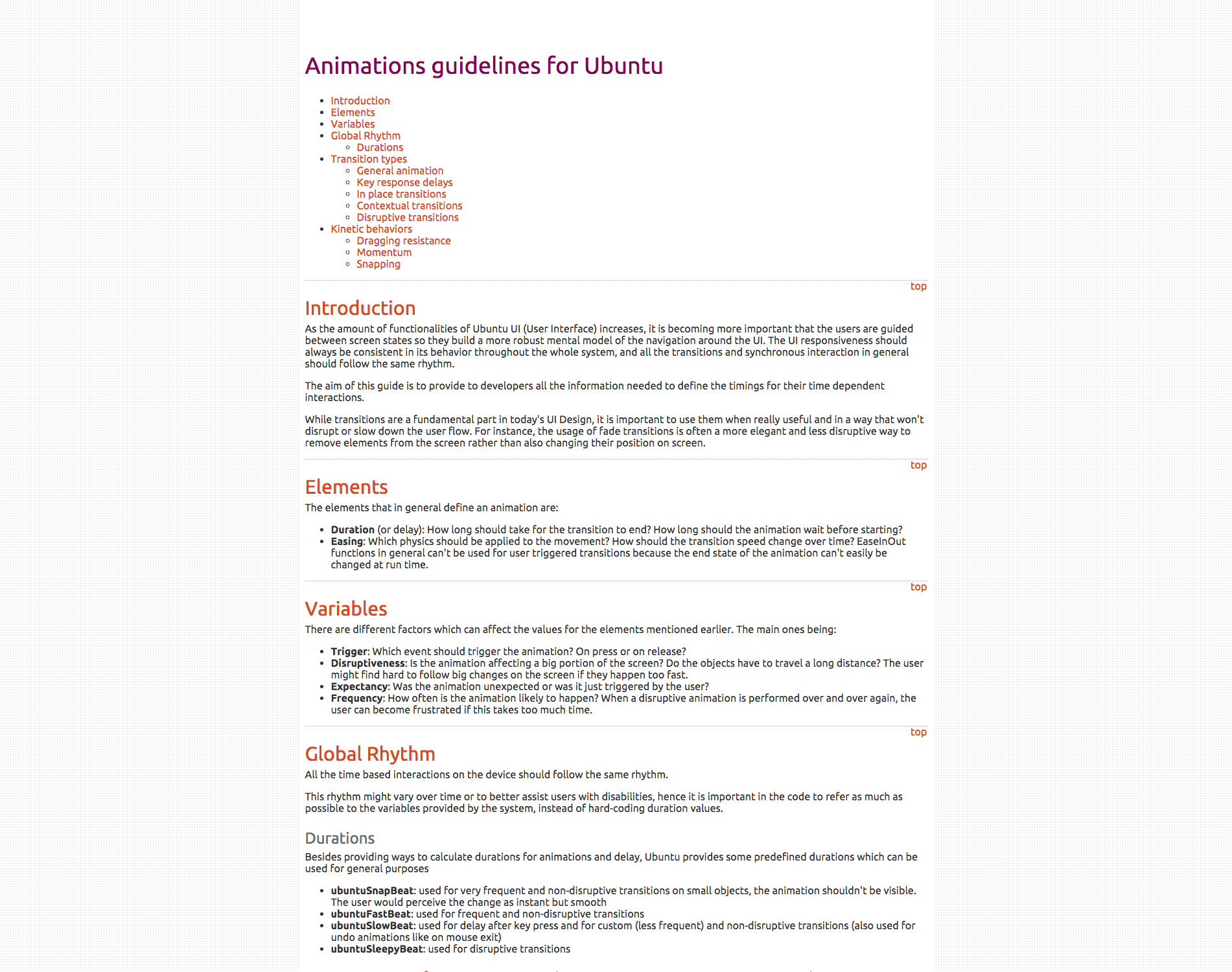
My last delivery was a set of animation guidelines to help shell engineers and app developers choose the right parameters when animating UI elements. They cover the elements of an animation, duration and easing; the variables that should change them, like what triggers it, how disruptive it is, whether it was expected and how often it happens; and a global rhythm of named durations, snap, fast, slow and sleepy, for the code to refer to instead of hard-coding values. Each type of transition has a live example to try in the browser, and the kinetic behaviours, dragging resistance, momentum and snapping, come with their formulas.
Outcome
Ubuntu won many awards over the years and Canonical grew its personnel considerably, tackling many new challenges. Unfortunately, launching new mobile platforms proved difficult from a technological and business point of view. The launch of the Ubuntu phone was delayed a couple of years, and my proposal must have gone through several more iterations before anything shipped.
After leaving Canonical I started Instants, partly to take what I had learned designing core interactions for Ubuntu to another platform.
Looking back
It was an honour to work on a piece of software that could impact so many millions of people, more than twelve million at the time, and especially people in developing countries. And to do it with such a big network of volunteers around us. It is also where I learned to work with a large, distributed team of very gifted engineers.